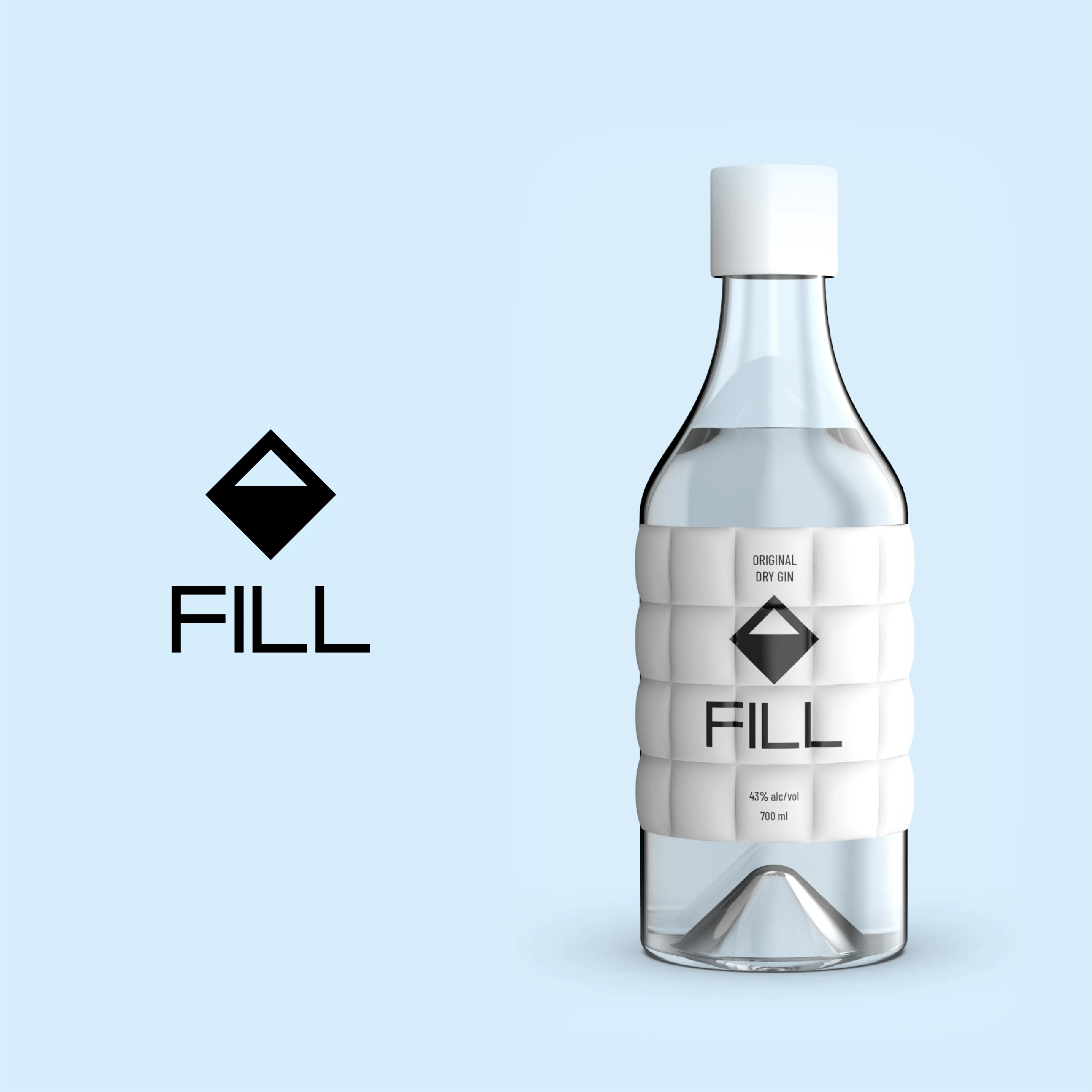
FILL Arctic Dry Gin FILL Arctic Dry Gin
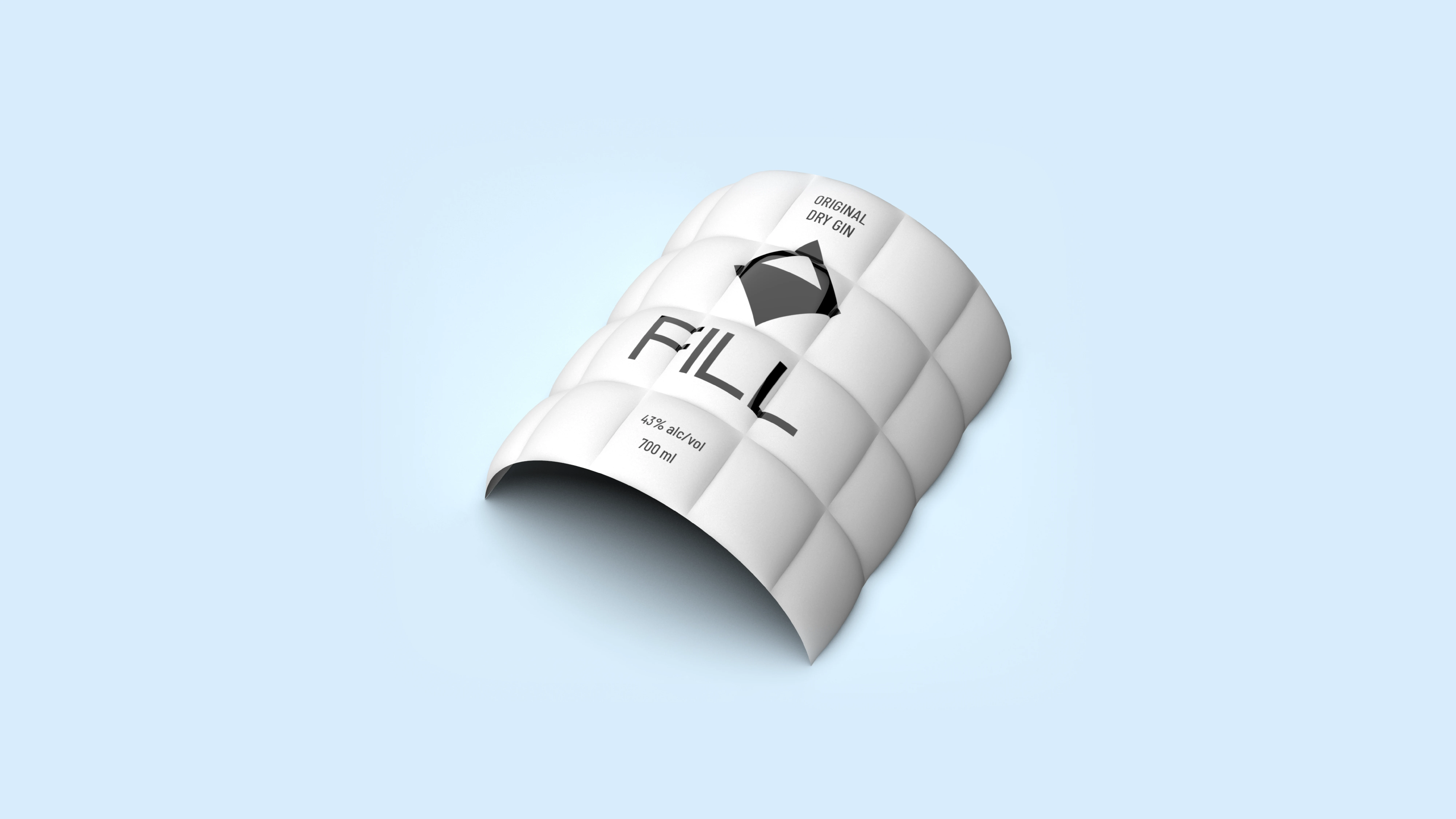
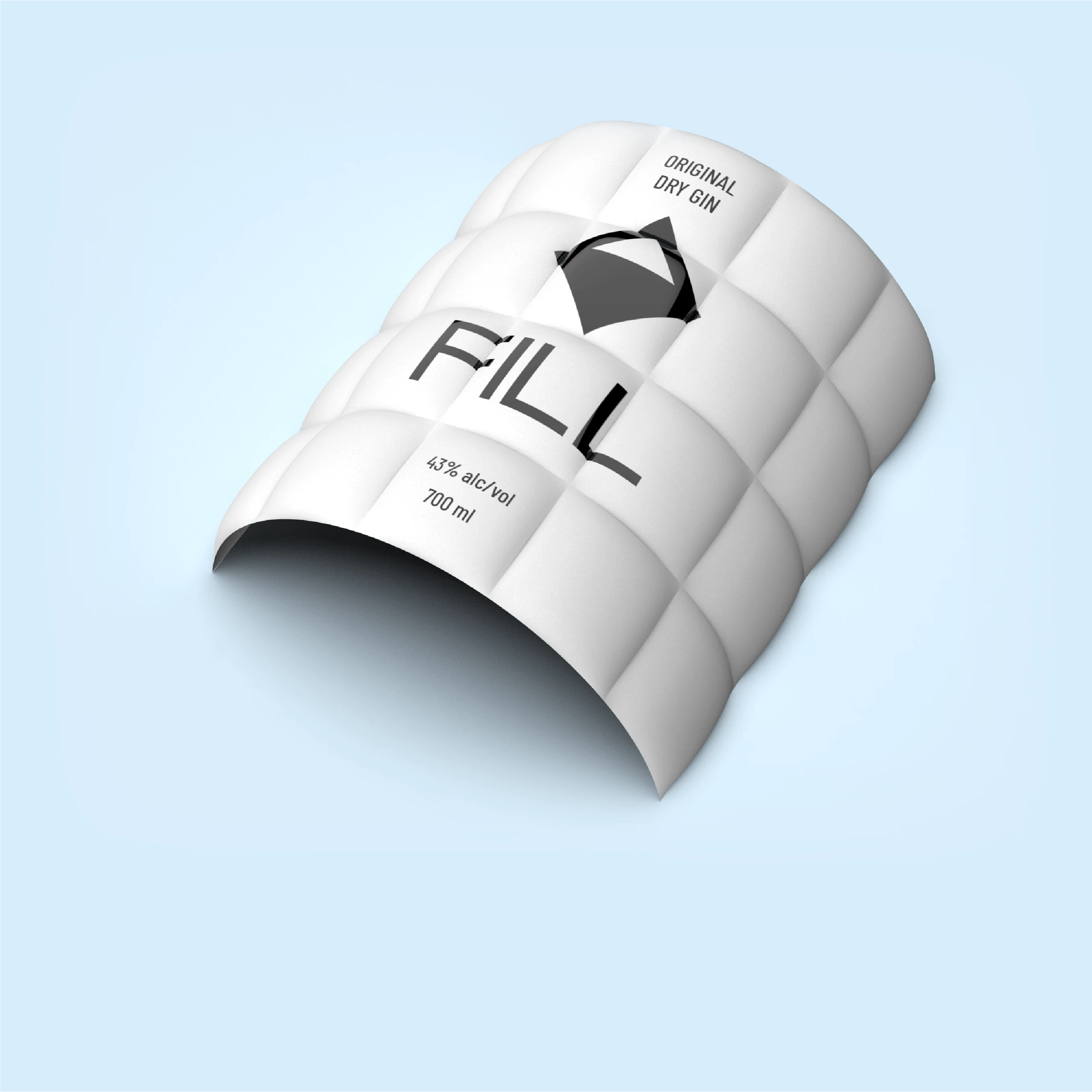
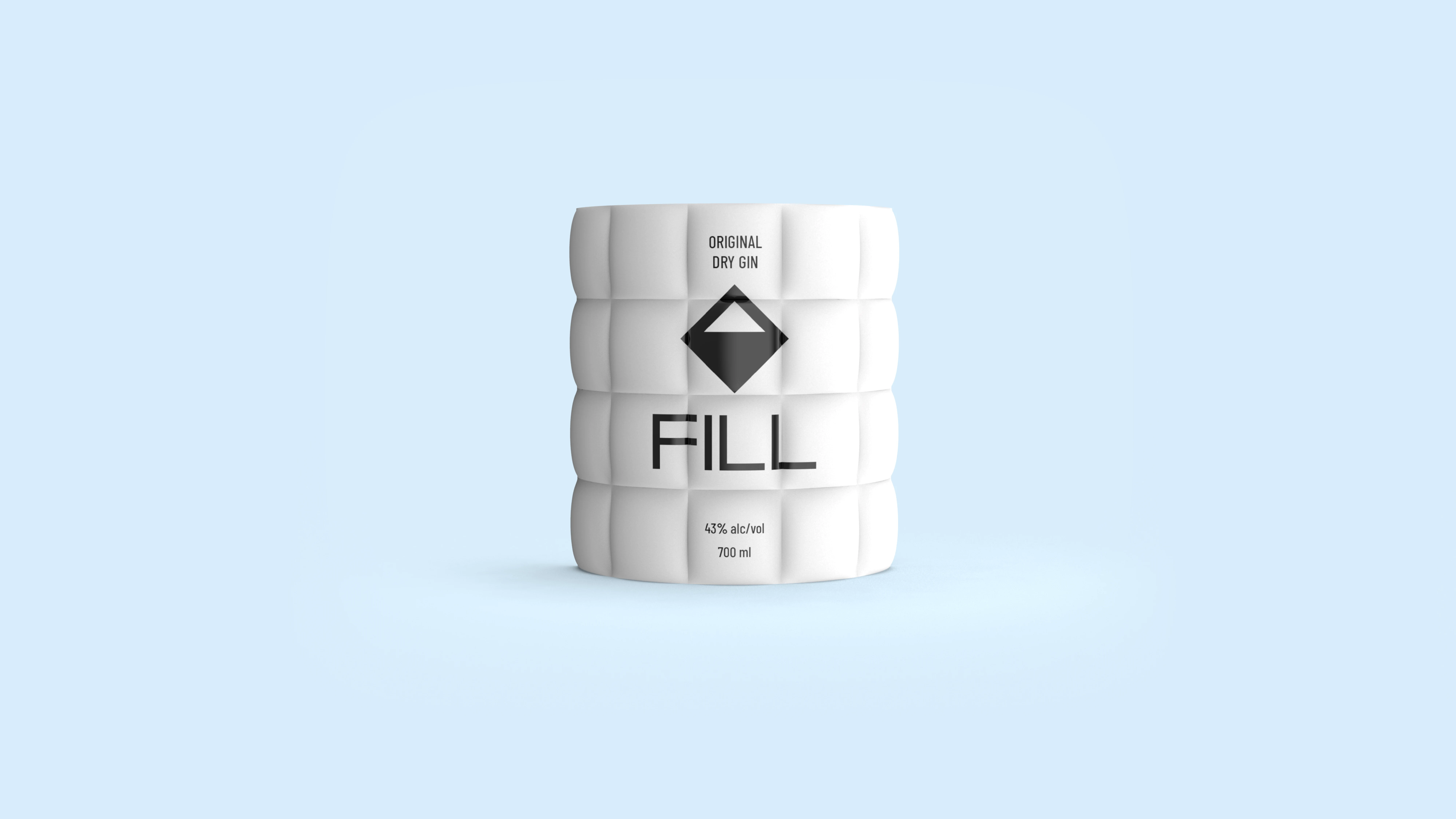
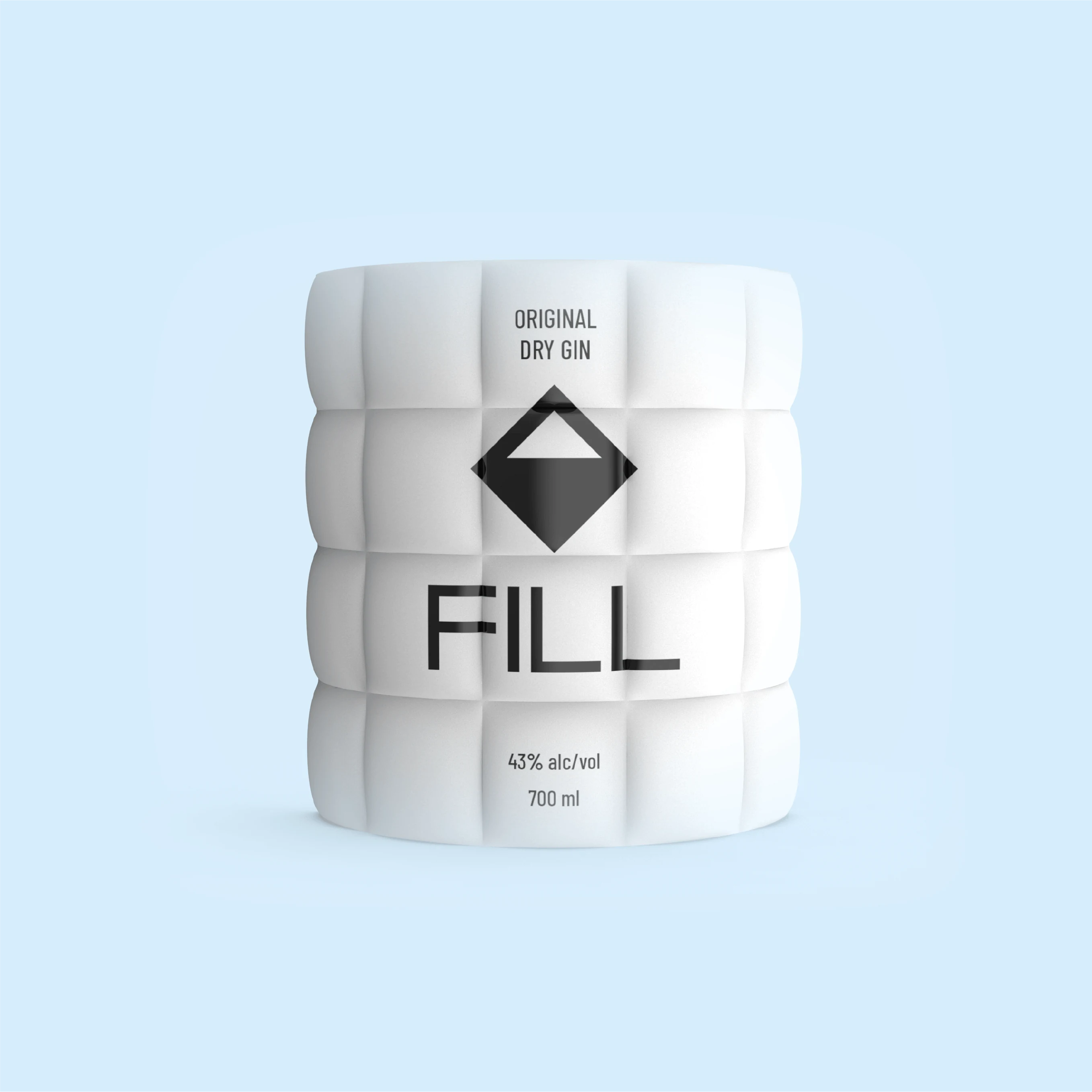
FILL label detail FILL label detail
The Label
Quilted.
Not printed.
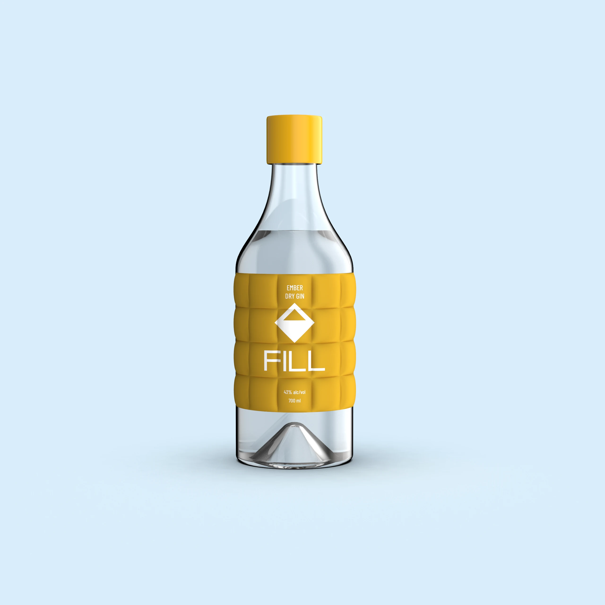
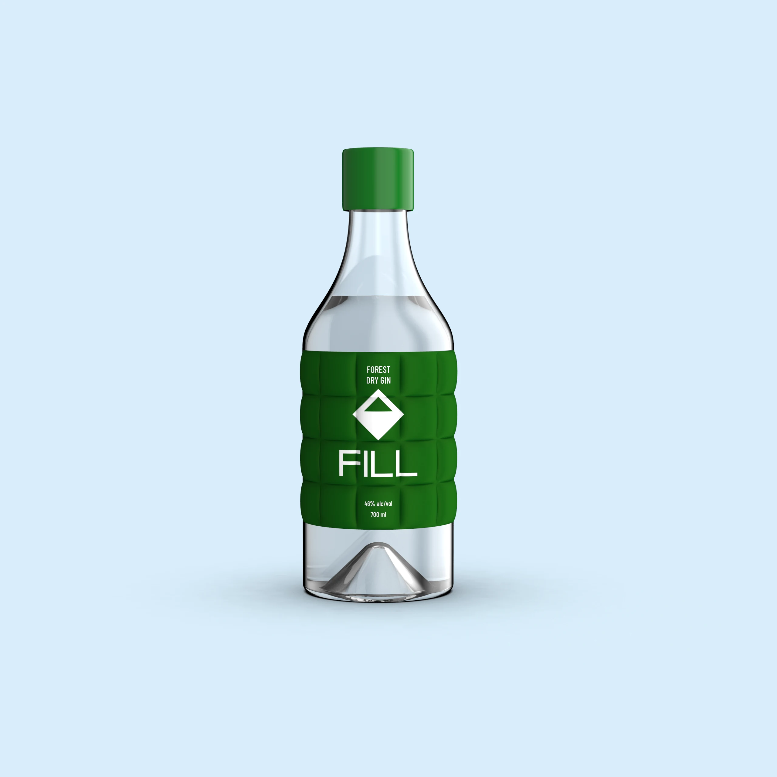
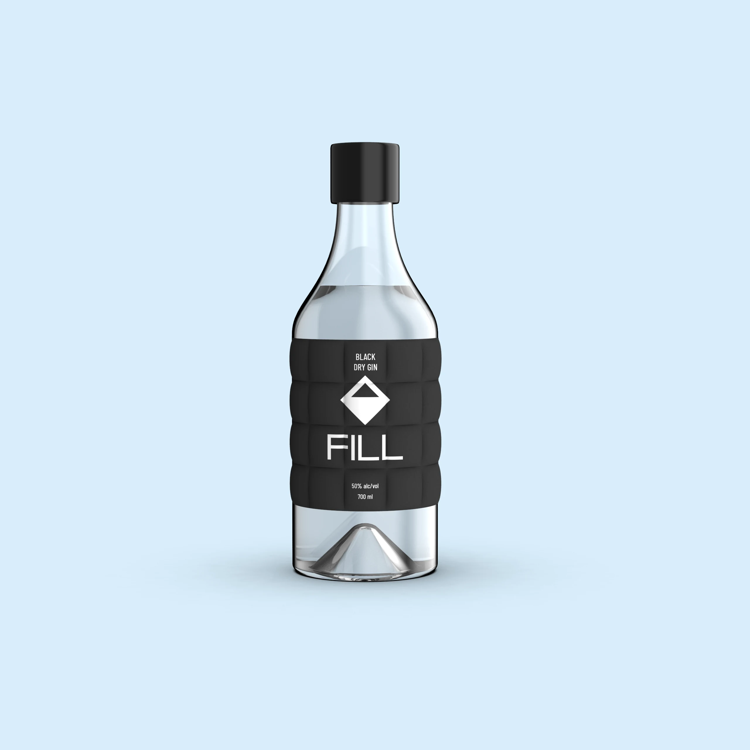
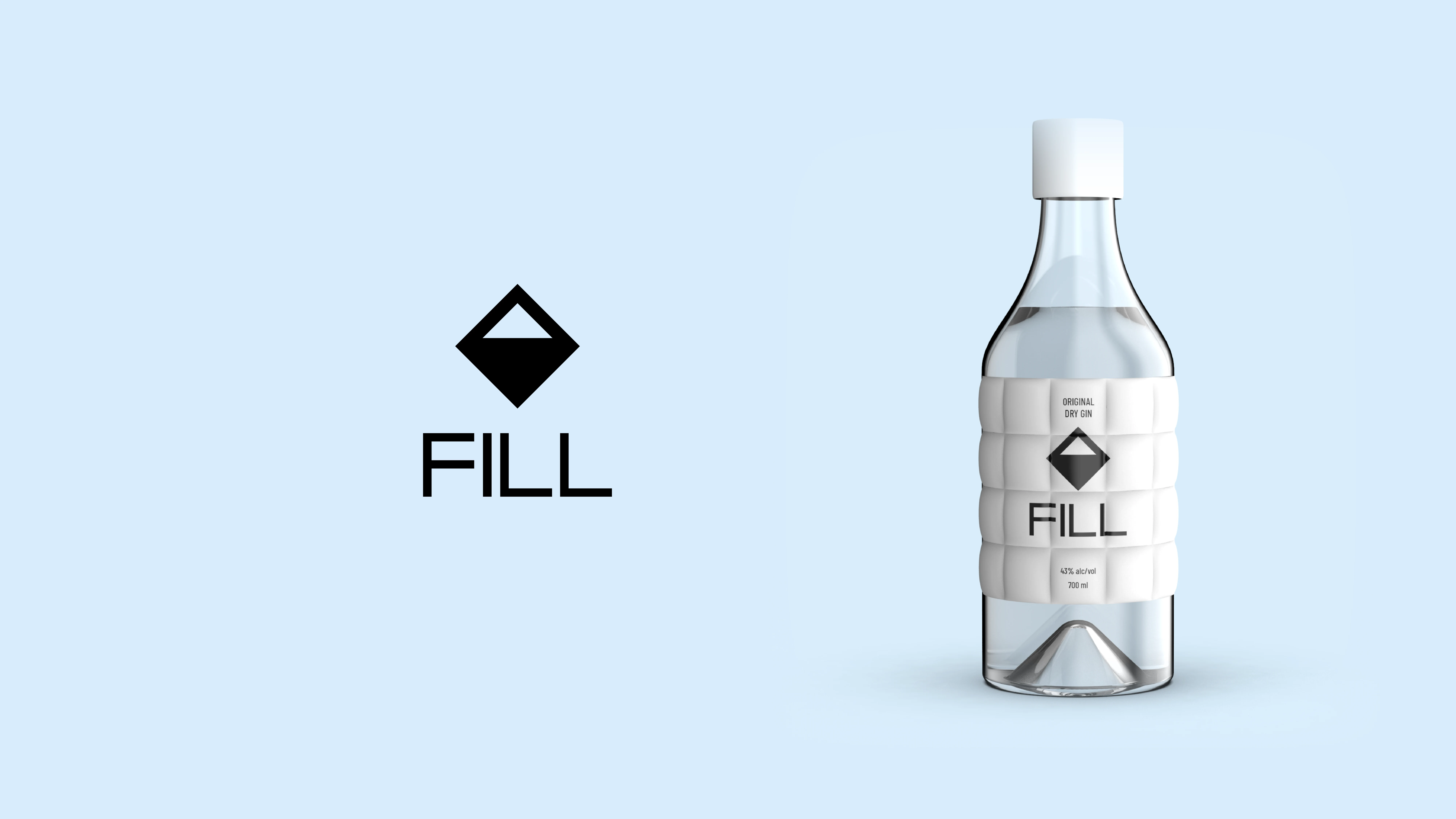
The label surface is a direct reference to box-quilt construction: the same geometry that traps warmth in technical outerwear.
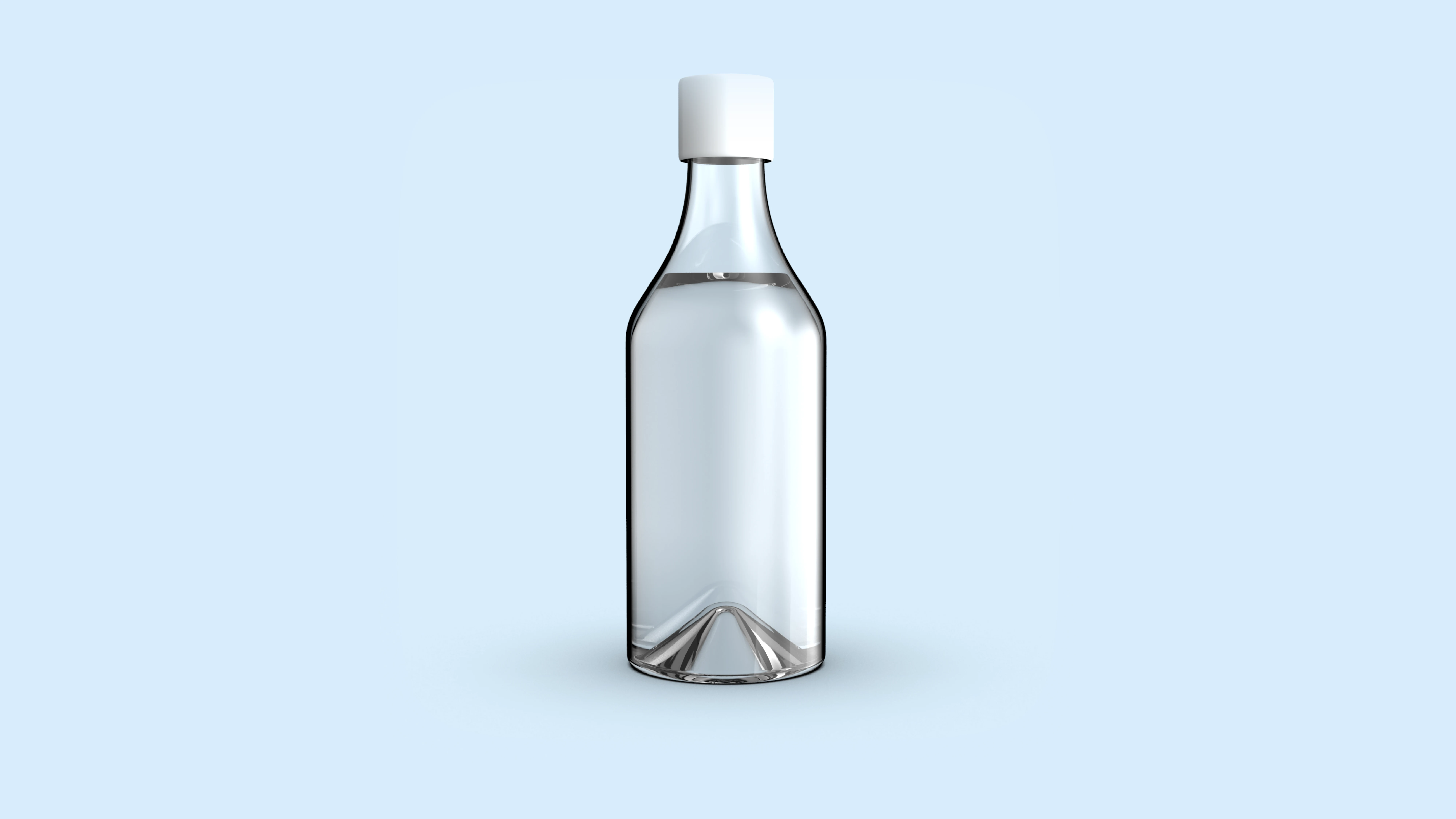
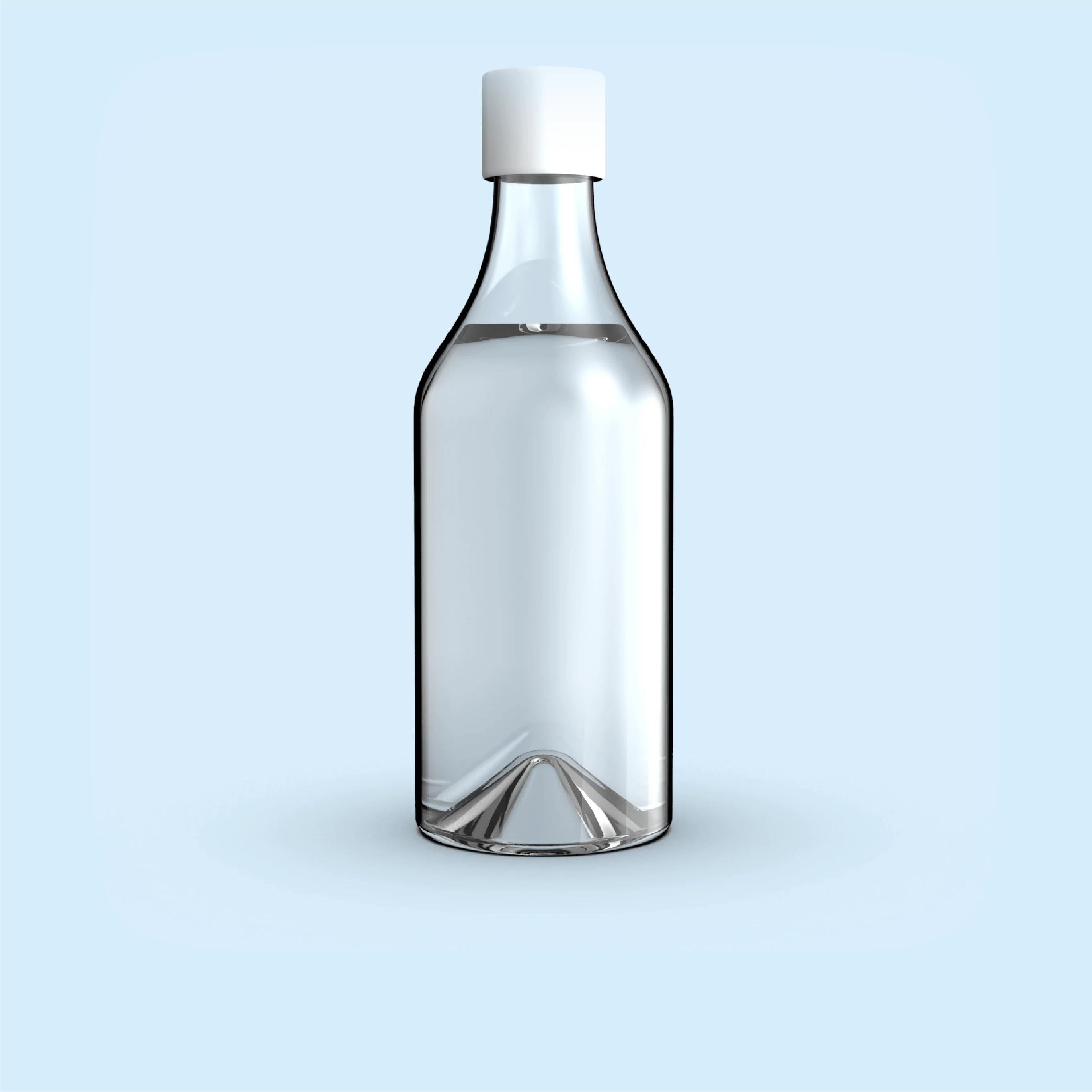
FILL bottle form FILL bottle form
The Bottle
The mark is
in the base.
The punt, the raised indentation moulded into the bottle base, forms a sharp inverted peak when seen through the clear glass. The same silhouette as the icon. Not applied. Cast in.
Category Distillation · Arctic Gin

An arctic gin.
For people who came in from the cold.

Category  Arctic Gin Market    Northern Europe / Global Concept  Self-initiated Agency   KOQEMUS
Fill Power 800  ·  Arctic Dry Gin  ·  43% Alc/Vol
01 · Category Diagnosis

Every arctic gin
looks identical

Walk any premium spirits shelf and count the arctic and Nordic gins. Then count how many visual languages they use. Clear glass. Blue or white label. Ice crystal motifs. Norse symbols or rune-adjacent typography. Glacier water provenance claims. The category operates from a single assumption: that "arctic" means "cold". It executes that assumption the same way, at every price point, in every market.

The assumption is not wrong. It is incomplete. And when everyone makes the same incomplete assumption, the shelf becomes a mirror. Different names. One visual language.

Finding 01

The arctic gin category communicates the environment of production rather than the experience of consumption. It sells the weather, not the reason anyone would want to be there.

02 · The Blind Spot

No one pours gin
to feel cold.

Cold is the experience. Warmth is the reward. Nobody goes to Lapland to avoid the cold. They go because of it. But every arctic story has a second act: the moment you come inside. The sauna, the fireside, the first drink. FILL is designed for that threshold. Where the cold you just survived makes the warmth mean something.

The dominant emotion in arctic winter culture is not the cold itself. It is the relief. The shelter. The earned warmth. The hot drink pressed into your hands when you come inside. The jacket that did exactly what it was built to do.

The category has built thirty years of branding around the first half of this experience.

FILL is an arctic gin. That is the subcategory — the entry ticket, not the message. On a shelf where every bottle declares its latitude, being arctic is not a differentiator. It is assumed. What no one has done is use that provenance as a starting point rather than an endpoint: acknowledge the cold, then talk about what it is actually for.

Finding 02

Every product in the category has been designed for the cold. None of them have been designed for the warmth that makes cold worth experiencing. That is the gap. It is still open.

02a · Competitive Field

The shelf. One idea.

The category has two defaults: depict cold through imagery, or claim a cold place through Nordic heritage. Ice crystals, glacier water, snow peaks. Runes, mythological symbols, provenance typography. The vocabulary differs. The message is identical: this product is from somewhere cold. Every brand on this shelf is saying the same thing in one of two ways.
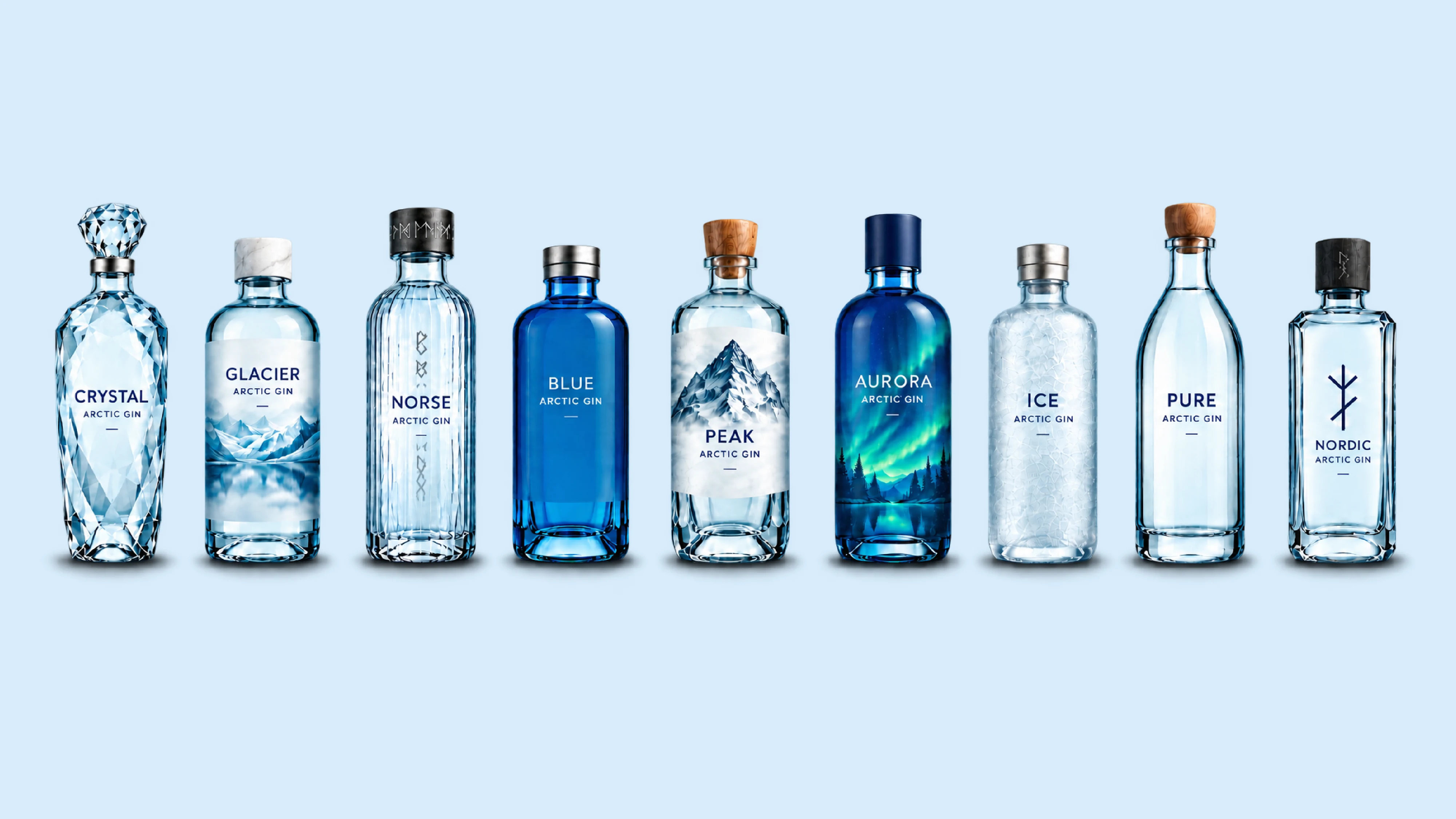
The arctic gin shelf
Cliché 01
Ice Crystal
Label motif. Visual shorthand for cold.
Cliché 02
Glacier Water
Provenance claim. Source as virtue.
Cliché 03
Norse Symbol
Runes, Vikings, mythology. Heritage by decoration.
Cliché 04
Blue Label
Colour = cold. Category default palette.
Cliché 05
Snow Peak
Mountain silhouette. Geography as promise.
Cliché 06
Northern Lights
Aurora as spectacle. Visual awe, no human story.
Cliché 07
Frost Type
Letterforms treated for cold texture effect.
Cliché 08
Clear Glass
Bottle as purity signal. Clean = cold.
Cliché 09
Nordic Rune
Ethnographic borrowing as brand identity.
FILL
None of the above.
Warmth as strategy. The moment after cold.
02b · Competitive Positioning

White space,
confirmed.

Almost every competitor mapped sits in the same half of the matrix. None occupy the Warmth/Human × Minimalist quadrant. FILL is the only brand where warmth is the strategy, not the absence of cold.

COLD / NATURE WARMTH / HUMAN MINIMALIST MAXIMALIST AXIS 01 | TONE AXIS 02 | AESTHETIC Isfjord Arctic Blue Kyro Hernö Sipsmith Bivrost Bareksten Botanist Beefeater Tanqueray Hendrick's Monkey 47 Gin Mare Aviation Harahorn Vidda Tørr Elg FILL

Competitors surveyed: Hendrick's, Kyro, Hernö, Bareksten, Botanist, Monkey 47, Beefeater, Tanqueray, Sipsmith, Arctic Blue, Isfjord, Bivrost, Gin Mare, Aviation, Harahorn, Vidda Tørr, Elg. Warmth/Human × Minimalist. FILL is the only brand where warmth is the strategy, not the absence of cold.

03 · The Naming

FILL

A name that works in two registers simultaneously, without forcing either. The technical anchor is invisible until you know it. The drinking ritual register requires no explanation at all.

800 Fill Power

Fill Power

In technical down apparel, fill power measures a down fill's ability to loft: to trap warm air and resist compression. 800 fill power is the benchmark for exceptional warmth. The number tells you precisely how well the jacket does its job. The warmth measure. Exact once you know it.

Fill my glass

Fill my glass

The most natural request at a bar. No product name, no brand recall required. The name disappears into the occasion because it was already part of the language. A brand that sounds like something people already say.

Finding 03

Fill power = the warmth measure in down apparel. Fill my glass = the most natural thing you say to a bartender. Two meanings. Neither forces the other. The technical anchor holds the concept; the social register makes it disappear into everyday use.

04 · The Mark

One symbol.
Four readings.

The FILL mark is a diamond with a white triangle cut into its upper portion. At face value it is a simple geometric form. Under examination, it carries four simultaneous readings, none forced, none cancelling the others out.

01
North Indicator
The upward-pointing triangle is the universal symbol for north, found on every compass, chart, and map. For an arctic gin, the brand mark is literally pointing to where the product comes from, without stating it.
02
Fill Level
The diamond reads as a container. The white triangle is the remaining air space. The solid black mass below is the fill. The mark visualises its own name: a vessel in the process of being filled.
03
Mountain Peak
The white triangle reads as a peak cutting through the dark mass below it. A mountain silhouette. Arctic geography without a single literal reference to ice, snow, or Norse mythology.
04
Compass Mark
The diamond itself is the classic form of a compass rose marker. The mark reads as navigation equipment: functional, directional, built to orient. At home on technical gear as much as a gin label.
FILL logo

The wordmark

FILL in a custom geometric typeface. Heavy, blocky, squared off at every corner. The letterforms carry the same logic as the label: performance over elegance. This is not the script of a heritage distillery or the thin sans of a Scandinavian lifestyle brand. It is built like outerwear. No curves that don't need to be there.

System

The symbol functions as a standalone mark at small scale: embossed on the label, stamped on the cap, pressed into the glass base. The wordmark operates independently at large scale. Together in lockup they anchor the full brand identity.

Finding 04

The north indicator is the primary reading and the strongest brand story anchor. Every other arctic gin tells you where it comes from through imagery. FILL points there.

05 · The Label

A jacket
for the bottle.

Every arctic gin uses the bottle as a canvas for its story. FILL uses the label as a garment. The quilted panels of a down jacket, each baffle stitched to trap warm air, wrap the bottle instead of a person. The visual language is immediately readable as cold-weather protection, without a single ice crystal or glacier in sight.

The distinction is structural: the competitor set communicates cold through imagery. FILL communicates warmth through form. The label does not show you an arctic environment. It wears one.
FILL label detail FILL label detail
06 · Variant System

Colour as flavour.

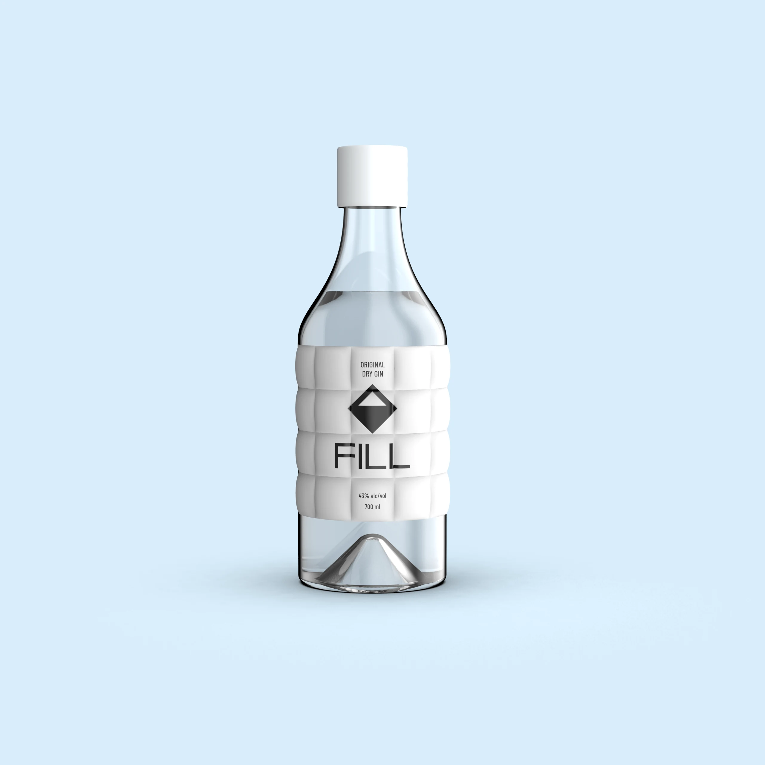
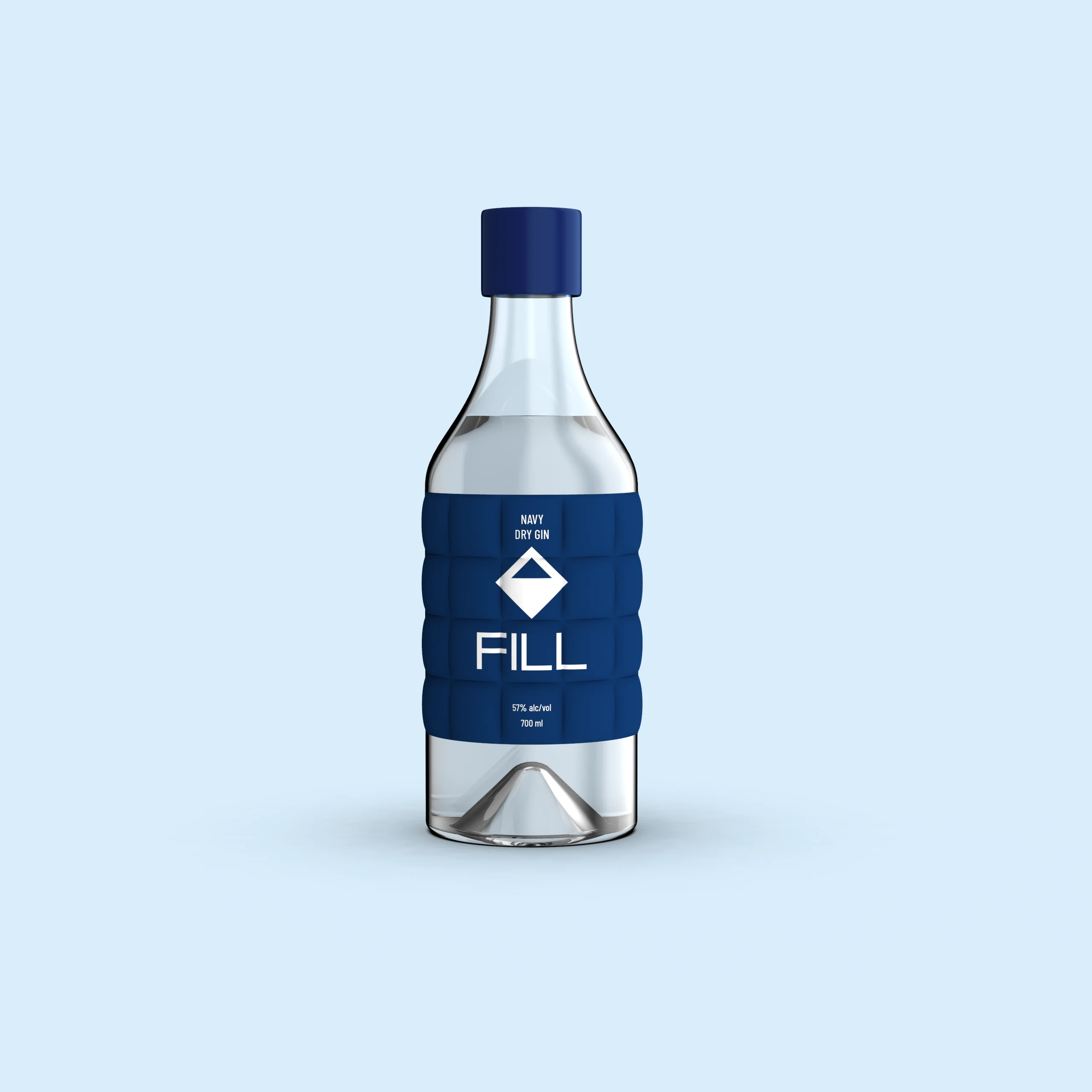
The base label is white, the colour of raw down. Each variant introduces a new colourway. Colour tells you what's inside. The system scales without explanation.
FILL Original
Core Edition
Original
The base expression. Dry and direct, built on juniper with a clean, precise finish. For when the cold has done its job and the first drink means the most.
43% Alc/Vol  ·  Arctic Dry Gin
FILL Navy
Seasonal Edition
Navy
The cold-weather expression. Higher proof for harder conditions. Full-bodied and warming. Pour when you have.
57% Alc/Vol  ·  Winter Release
FILL Ember
Limited Edition
Ember
For the moment the jacket comes off. Cardamom and citrus peel over the base spirit — warmth as transition, not shelter.
43% Alc/Vol  ·  Spiced Expression
FILL Forest
Reserve Edition
Forest
Pine resin and alpine botanicals in a foraged register. For the return from elevation. When the mountain is still in your lungs.
46% Alc/Vol  ·  Alpine Expression
FILL Black
Special Edition
Black
Barrel-rested. Smoke and vanilla over the base spirit. The extreme-condition expression, built for the coldest occasions and the longest nights.
50% Alc/Vol  ·  Barrel Reserve
07 · Brand Identity

Character.
Promise. Voice.

Three things define how a brand operates: what it is, what it promises, and how it speaks. For FILL, none of these are separate decisions. They follow from the same logic. The archetype is the Explorer: someone who has already done the hard part and earned the warmth. The promise is restraint: the right gin for the right moment, without being told how to feel about it. The voice is the proof of both: precise, assured, and warm without performing it.

Brand Archetype
Explorer
Prepared · Functional · Earned
Distinct from the romantic Explorer (adventure, discovery, wanderlust). FILL's Explorer has already done the trip. They chose the right jacket, the right route, the right gin. The warmth is not accidental. It was planned for. The brand speaks to someone who takes cold-weather drinking as seriously as cold-weather dressing.
Brand Promise
"We give you the right gin for the moment you've earned, without telling you how to feel about it."

Tone of Voice

ToV 01
Functional
Precise. Technical where the product earns it. Specifications are real. Fill power is a number, not a metaphor.
Not: vague warmth language, mystical Arctic prose, botanical lists as poetry.
ToV 02
Assured
No superlatives. No claims the product can't back. The confidence is in restraint. The brand doesn't need to shout.
Not: "the finest arctic gin", "unrivalled", "exceptional craftsmanship". If it's true, the product proves it.
ToV 03
Warm Through Restraint
The warmth is in what's left unsaid. Short sentences. White space between thoughts. The product is the warmth. The copy doesn't need to be.
Not: cosy language, "gather round", fireplace stock imagery, forced intimacy. The brand earns warmth. It does not perform it.
ToV 04
Literate, Not Literary
Reads well. Knows its references. Doesn't perform them. The audience is design-literate. When language is inventive, it should feel inevitable. The best line is one that couldn't have been anything else.
Not: overwrought metaphor, Scandi lifestyle romanticism, tricks that need a wink. Wordplay earns its place when it comes from the product's own territory. It loses it when it exists to show off.
08 · Brand Positioning
Fill my glass.
The occasion brand.

For urban active adults who drink deliberately and identify with design-conscious lifestyle culture, FILL is the premium arctic gin that makes warmth the differentiator. In a category built around the cold side of the arctic experience, we are the only brand designed for the moment you come in from the cold, earn the warmth, and fill your glass.

Brand Core

FILL exists to give the cold-weather drinking moment a brand worth reaching for, through an object so deliberately designed it tells the story without a word.

Primary messaging — brand-level, used in all channels
Warmth is not a feeling. It is a specification.
Every arctic gin looks cold. We are the one that keeps you warm.
Secondary messaging — occasion and product level
"The only gin dressed for the occasion."
"Designed for what comes after the cold."
Campaign / Executional — FILL name as active lever
Refill
Repeat purchase as brand ritual.
The name becomes the call to action.
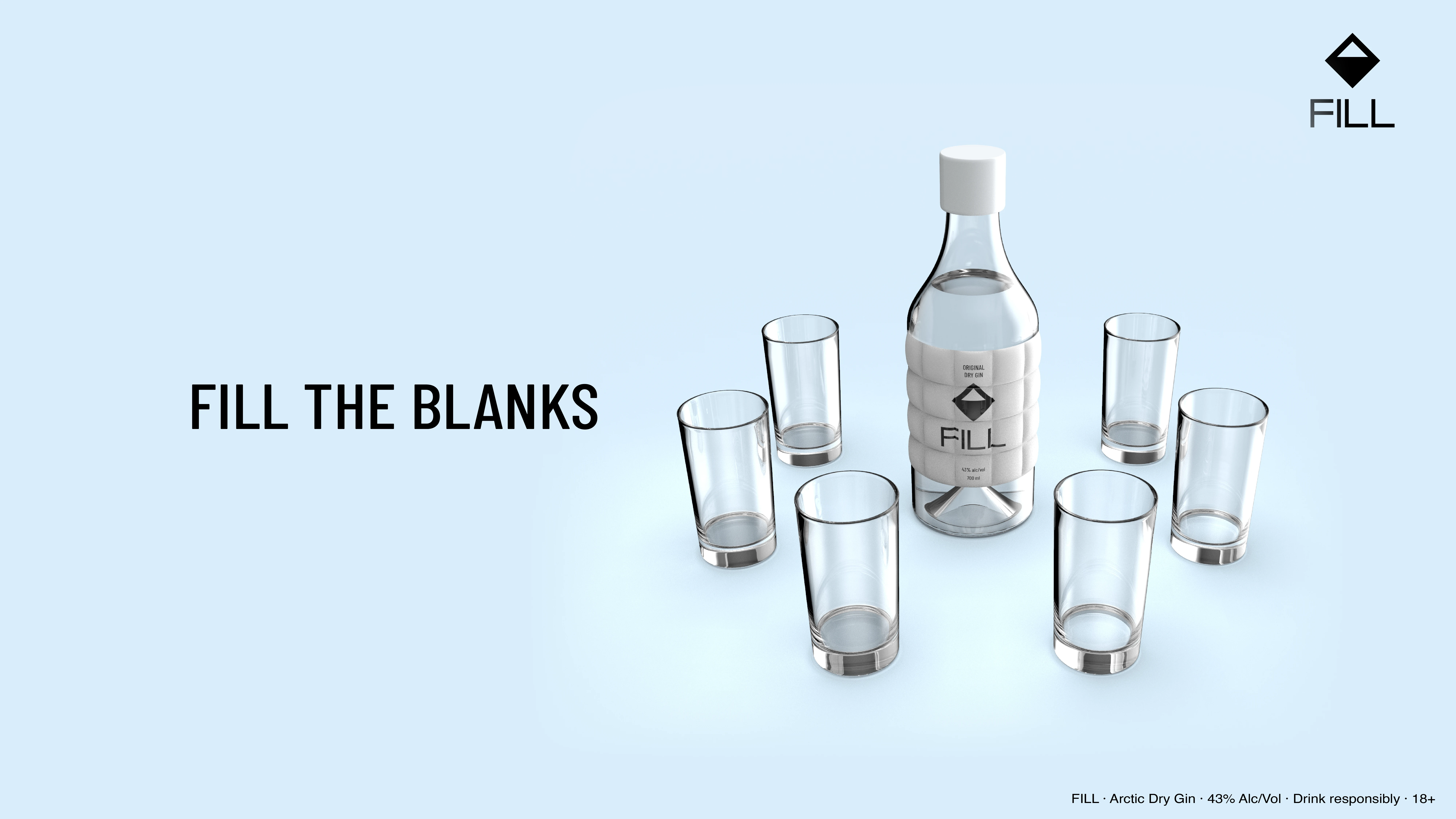
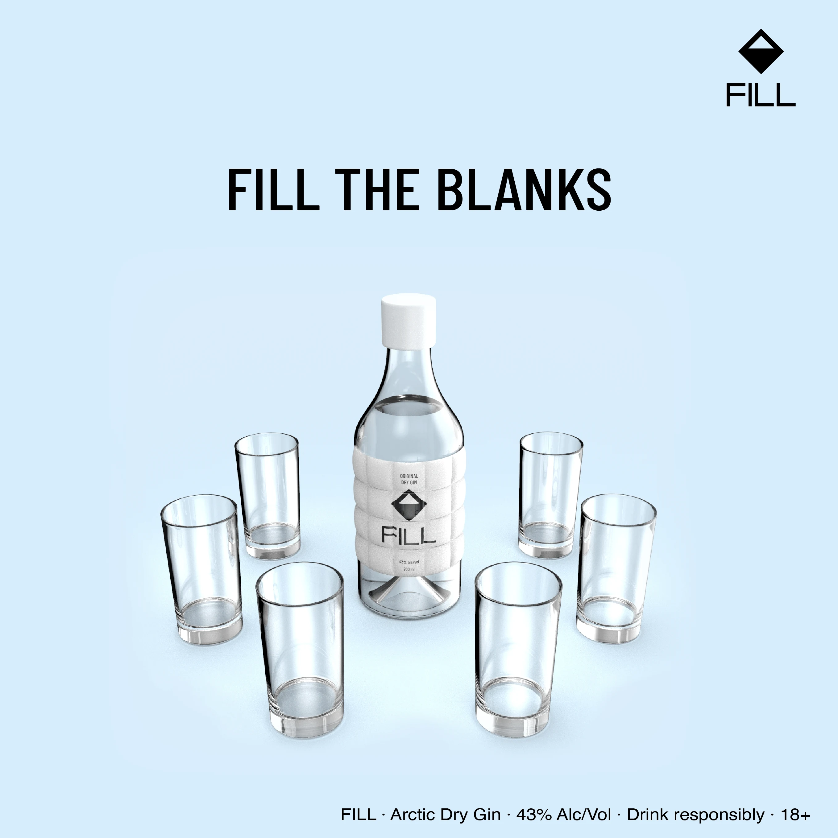
Fill the Blanks
The name as open proposition.
Occasions, glasses, people: consumer completes the sentence.
09 · Brand Extension

The identity, extended.

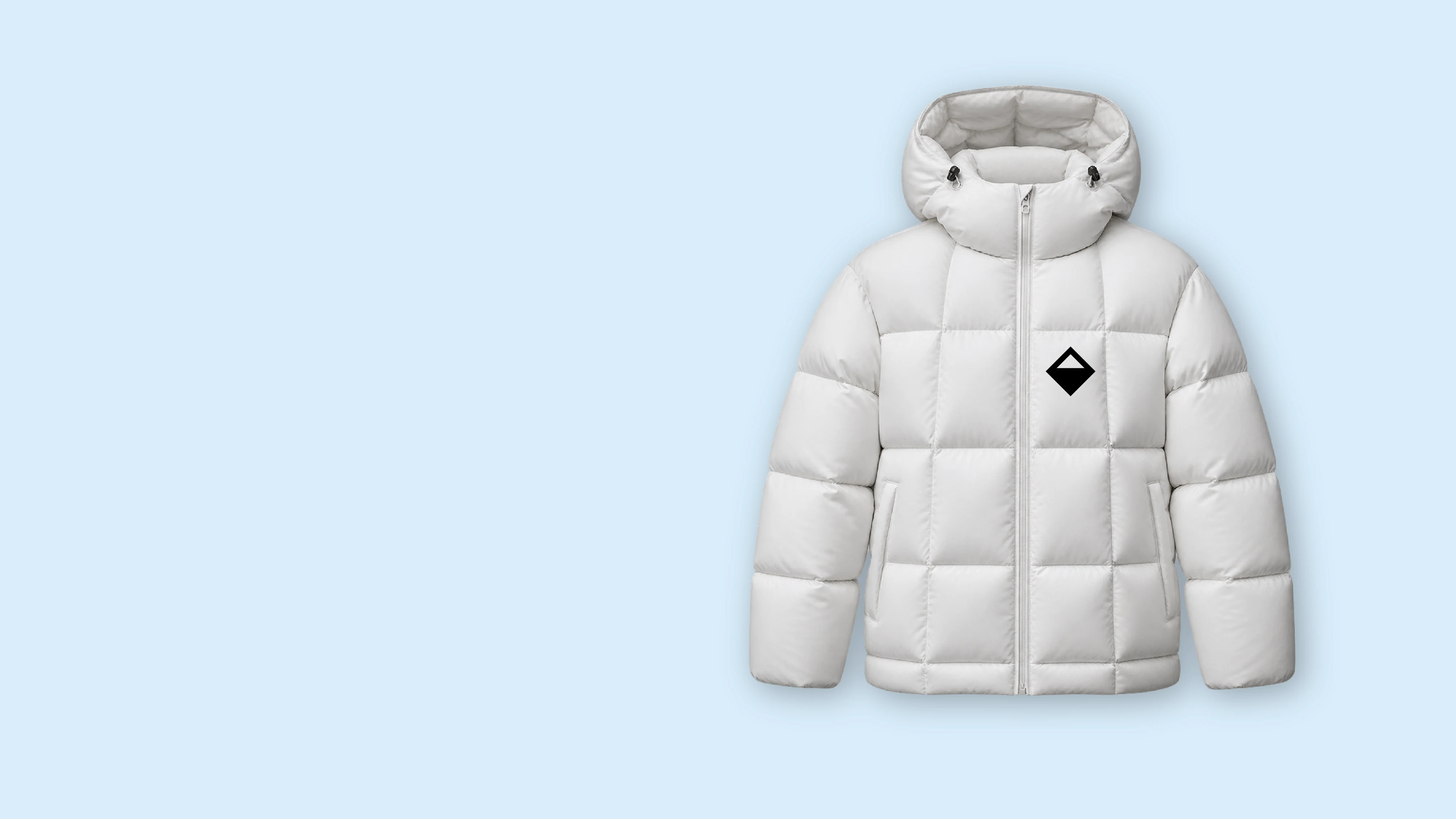
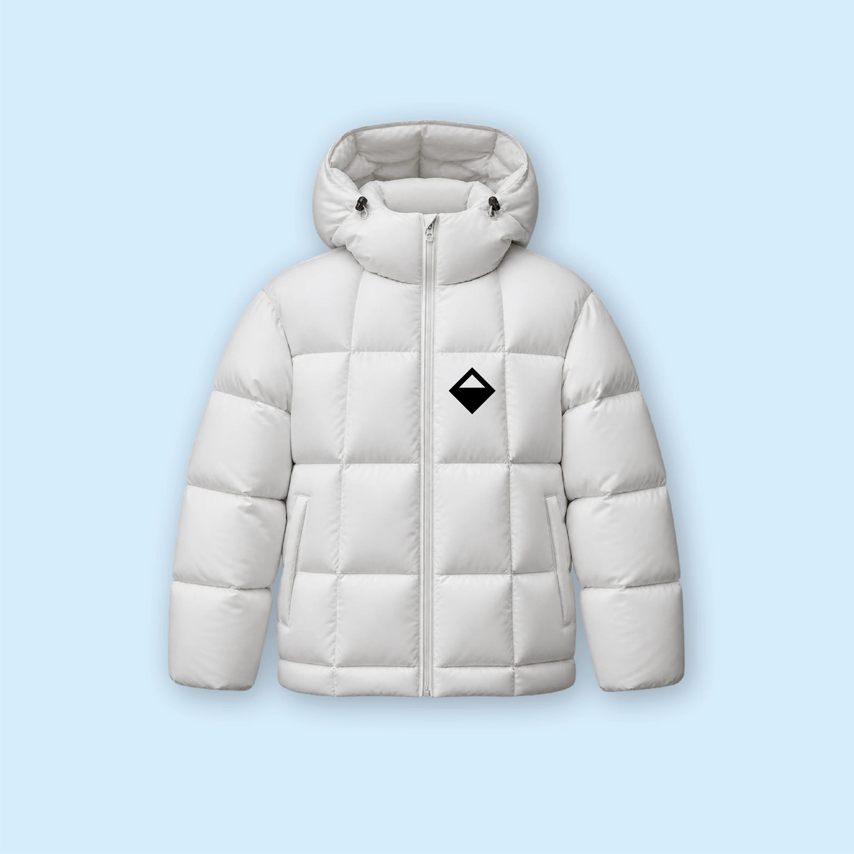
Merchandise demonstrating how the visual identity moves beyond the bottle into wearable brand objects. The mark needs no context in either application — it carries the brand without explanation, on materials that do exactly what the gin is named after.
FILL Jacket FILL Jacket
09 · Brand Extension
Jacket
The mark moves off the bottle and onto the body. A white 800-fill down jacket with the FILL diamond — warmth made wearable. Something you choose to be seen in before you come in from the cold. Technical insulation meets the same specification the gin is named after: fill power, the benchmark the brand was built around.
800 Fill Power  ·  Down Jacket
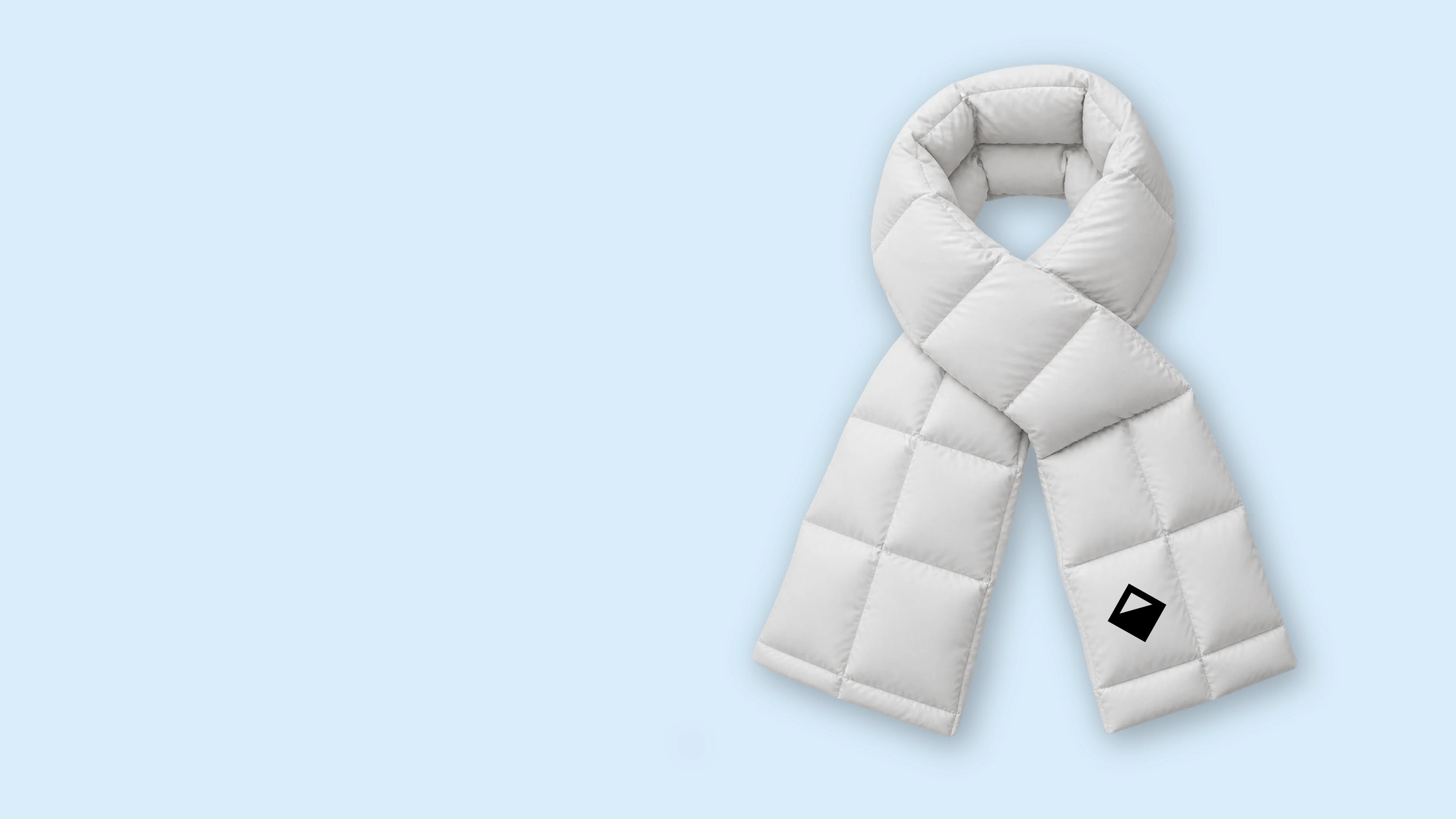
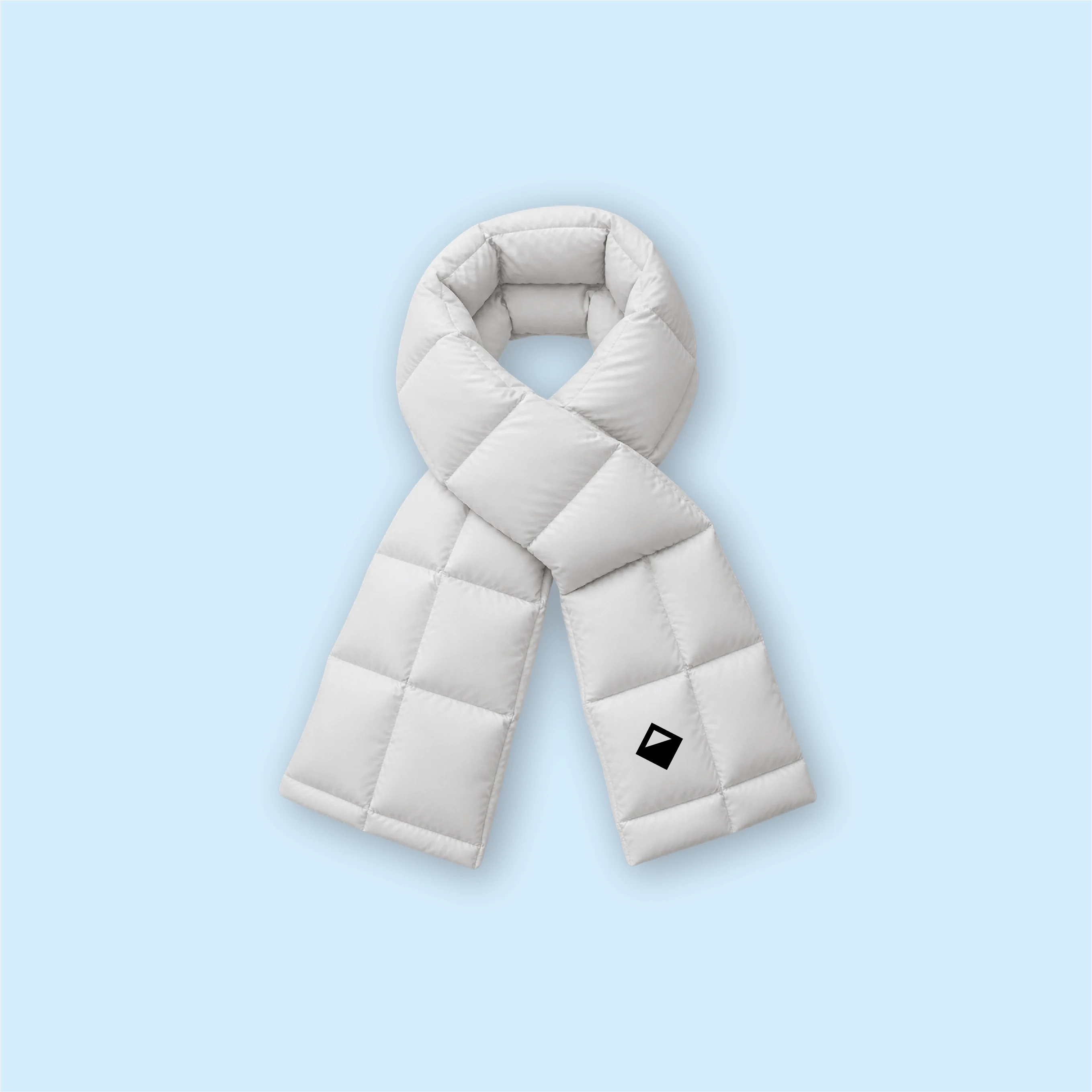
FILL Scarf FILL Scarf
09 · Brand Extension
Scarf
The same mark, in white, no explanation required. The fill is in the construction — the brand's core reference built into every quilted panel. Extends the identity into cold-weather accessories without diluting it: the diamond carries it alone. White quilted down, black mark, 800 fill power. Warm, not subtle about what it is made of.
800 Fill Power  ·  Down Scarf
10 · Advertising Examples

The brief, applied.

Two executions from the same positioning. Each uses language from the brand's functional territory and turns it into a moment. No landscape. No heritage claim. No cold imagery. Just the glass, and what it means to fill it.
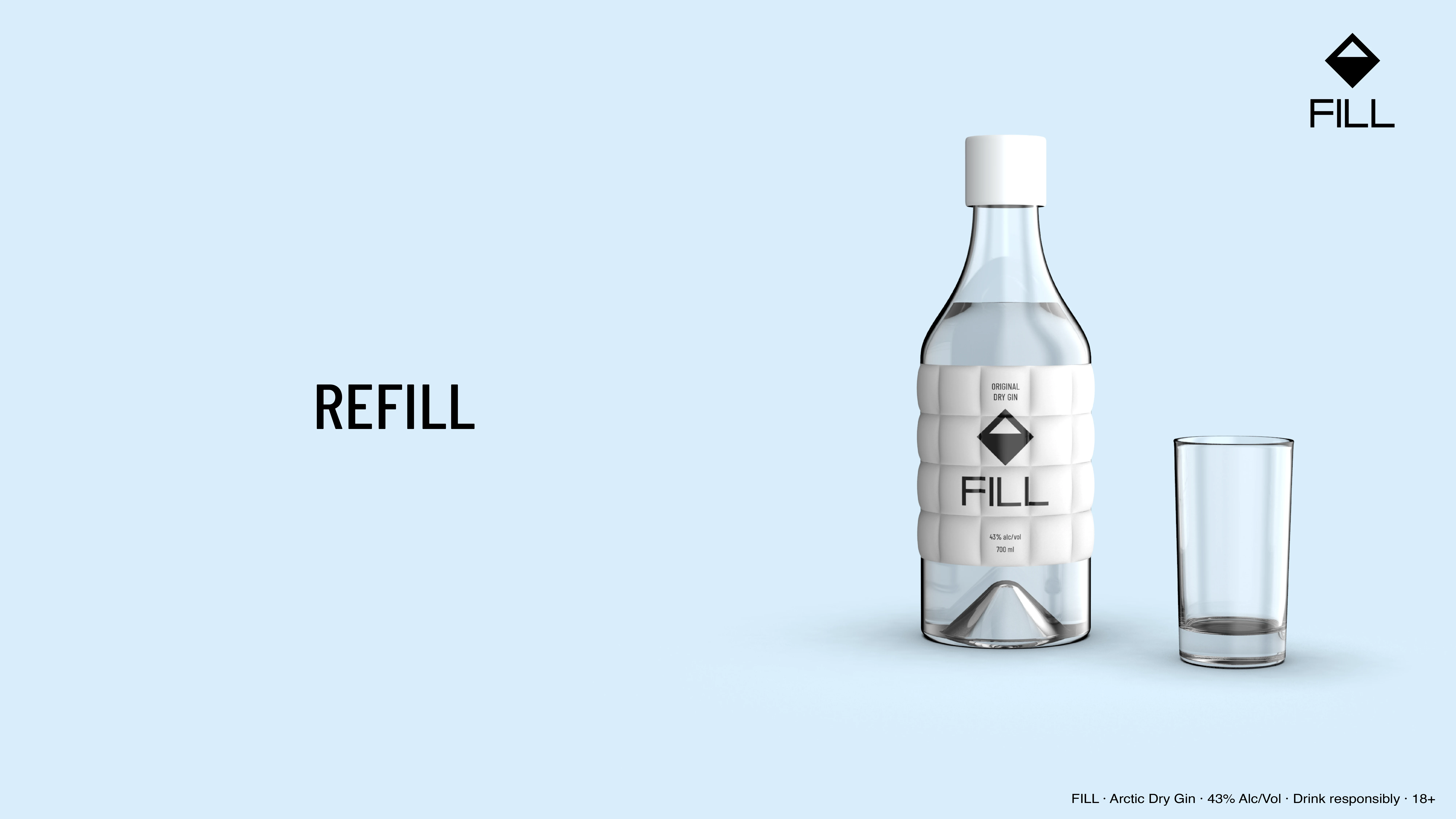
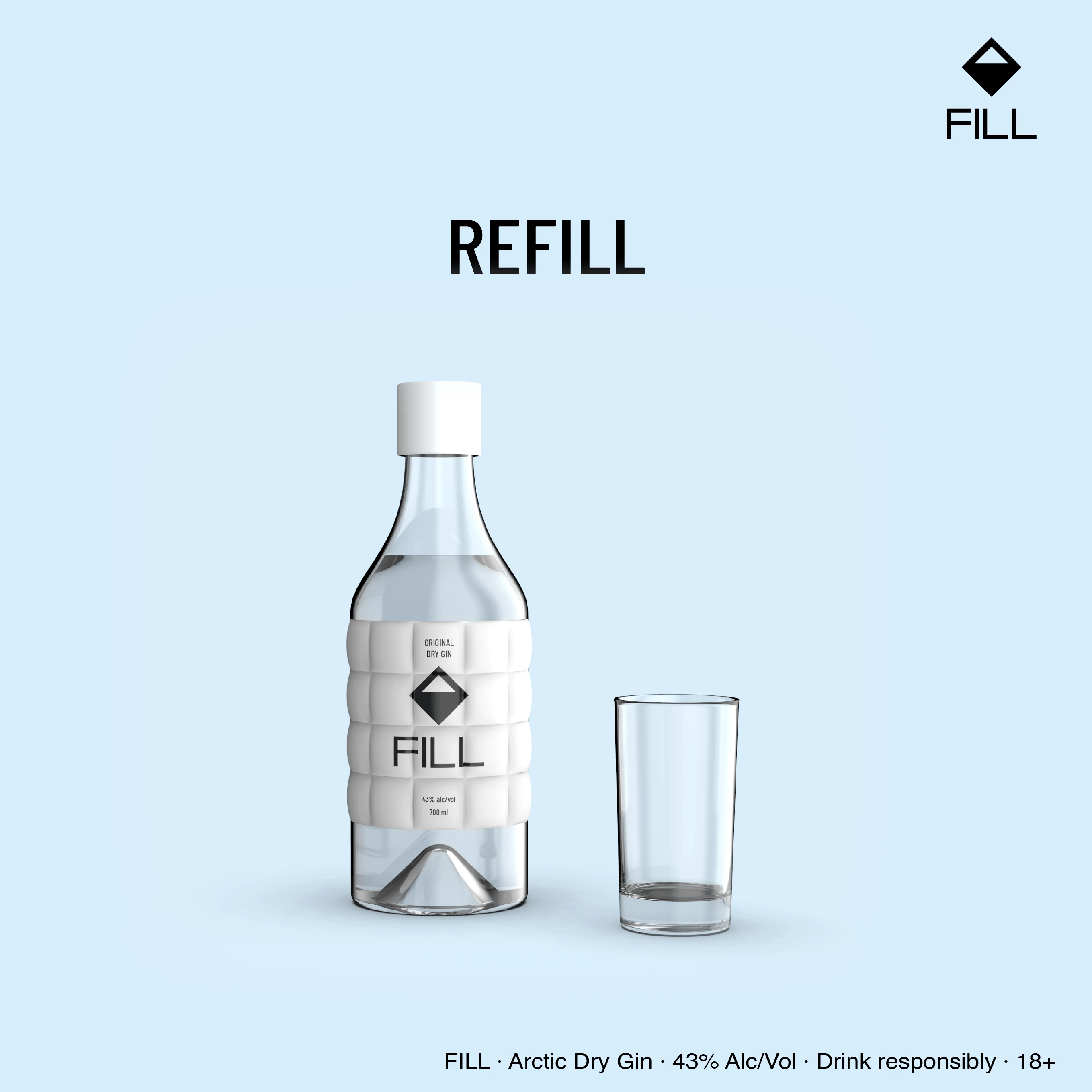
REFILL ad concept REFILL ad concept
REFILL
Fill the Blank ad concept Fill the Blank ad concept
FILL THE BLANKS

This page demonstrates KOQEMUS's full-chain methodology applied to a live concept brief. Category distillation, competitive analysis, insight extraction, naming rationale, design language, and positioning are produced as standard deliverables for any new brand or market entry engagement. FILL is a self-initiated concept. koqemus.com